Harvest Language Center
Educational Language Center
DESCRIPTION
Harvest International School had already built a trusted name in education in Benghazi. With the launch of Harvest Language Center, that legacy was ready to reach beyond the classroom, opening new doors to language learning, cultural exchange, and global communication. Why Studio was commissioned to shape a visual identity for this new chapter; one that could carry the credibility of its parent institution while establishing a character of its own.
TAGS
INDUSTRY
Education
YEAR
2024
SERVICES
- Visual Identity
BRIEF
The challenge was not simply to create a new logo, but to find the right balance between continuity and distinction. The Language Center needed to feel unmistakably part of the Harvest family, yet communicate a broader, more internationally oriented purpose. We set out to build an identity that brings together academic integrity, the spirit of learning, and the idea of connecting people and cultures through language.
FINDING
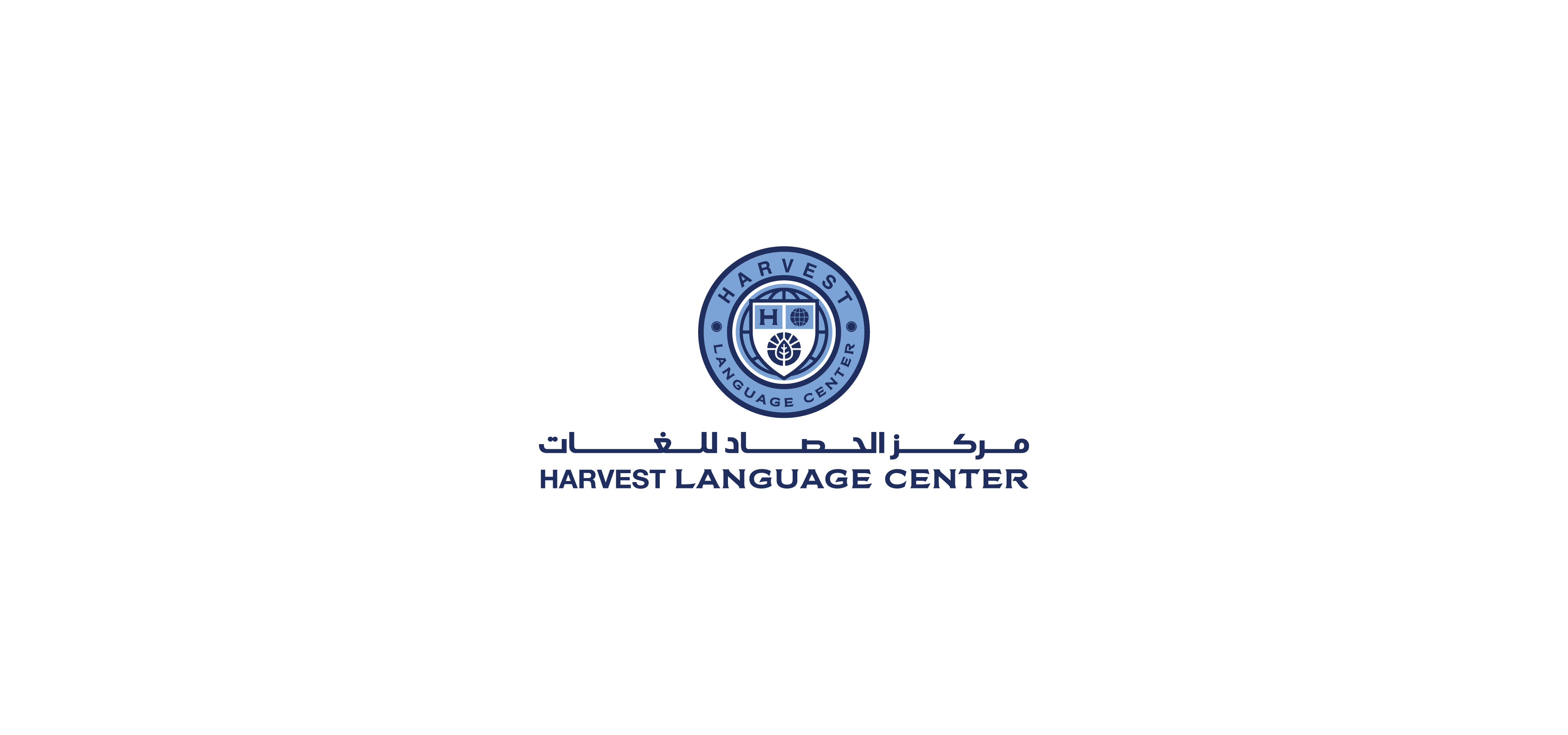
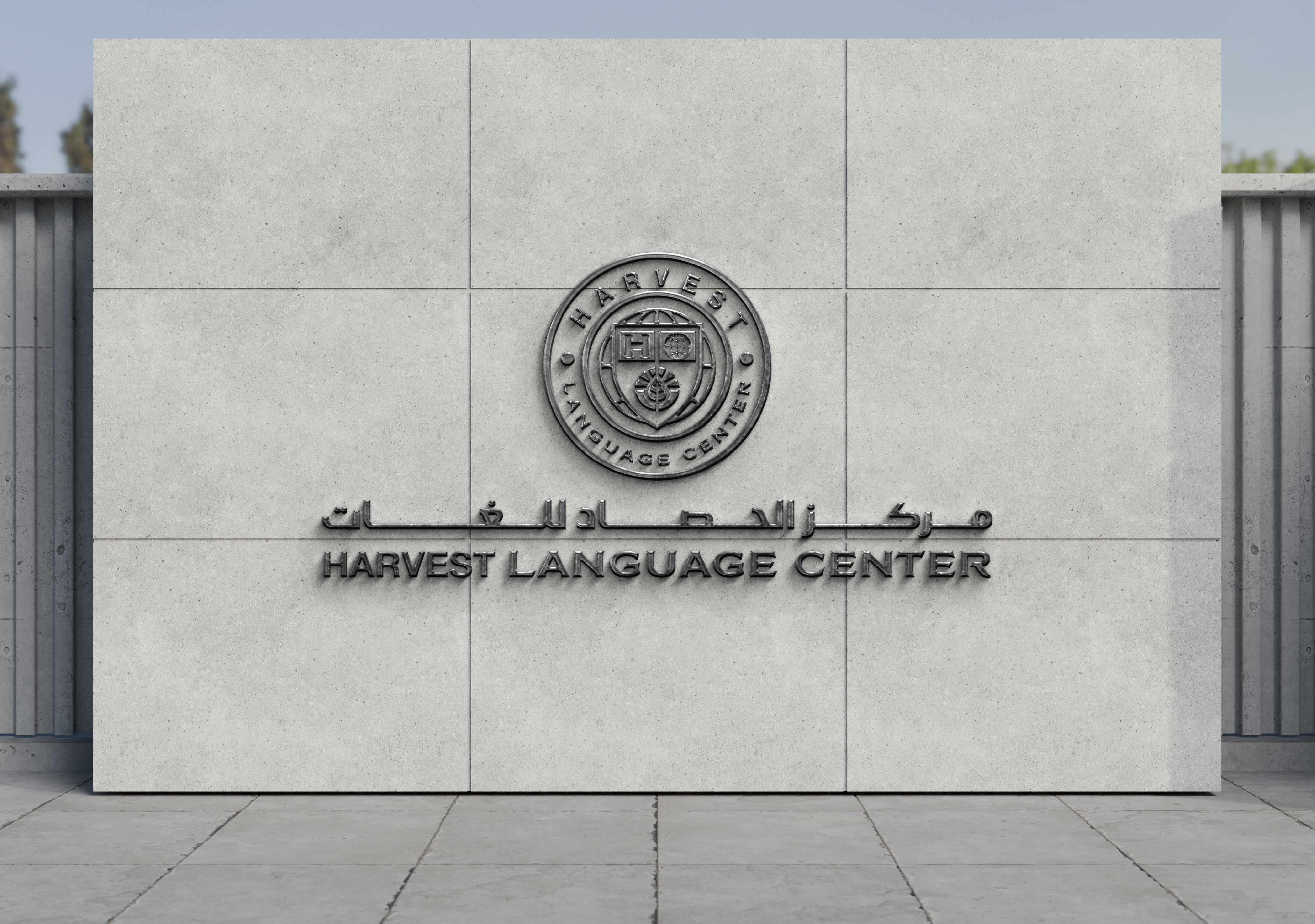
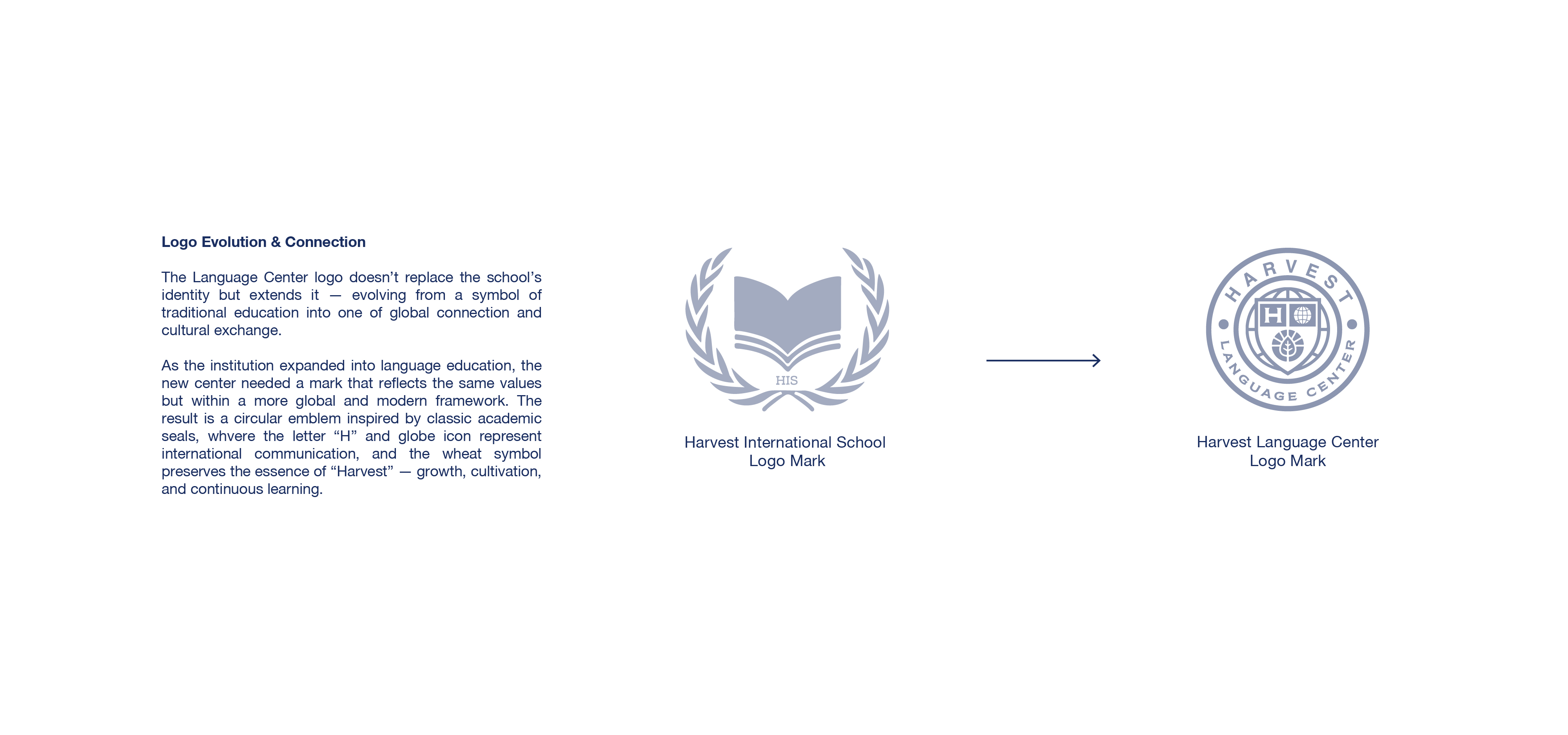
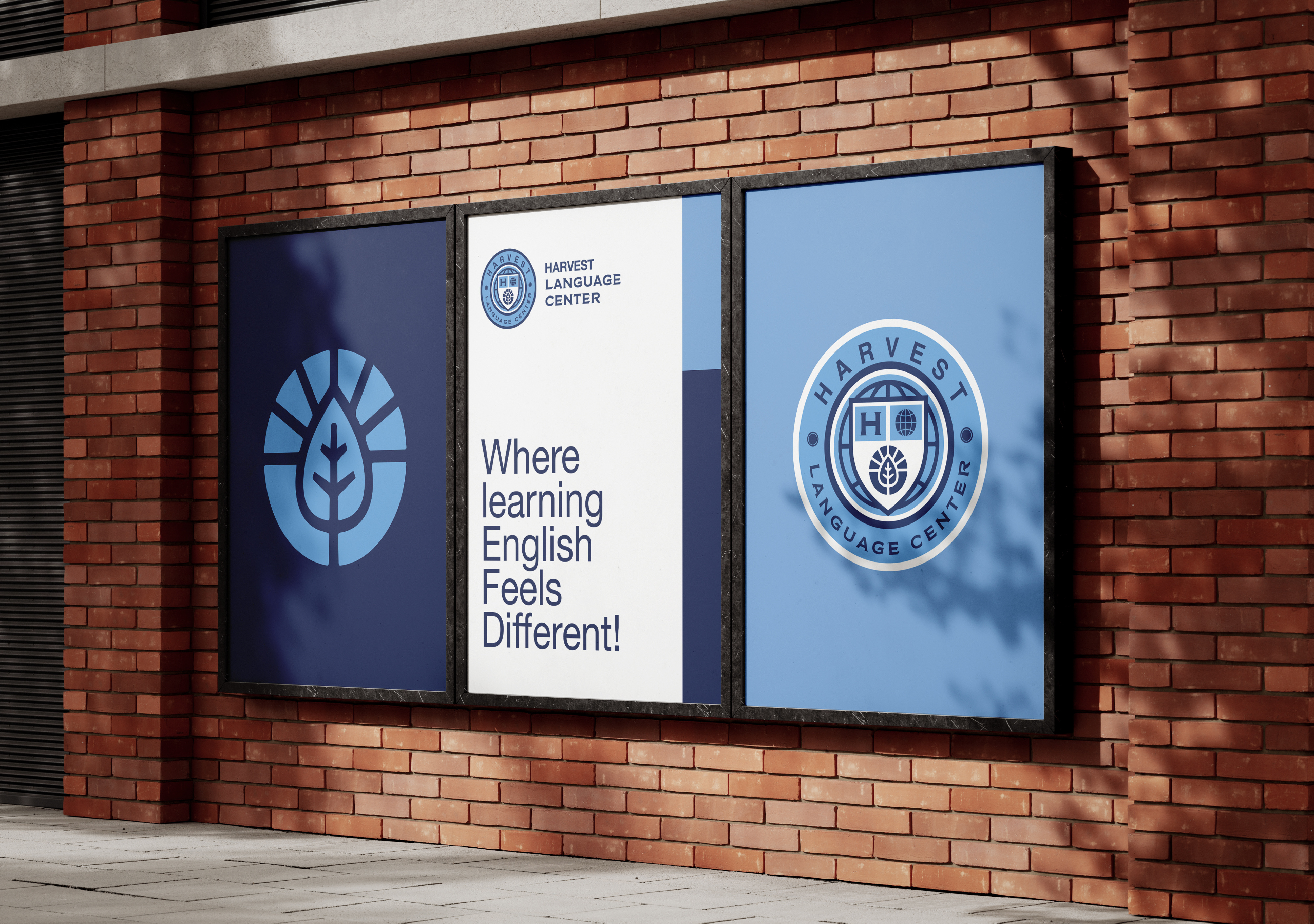
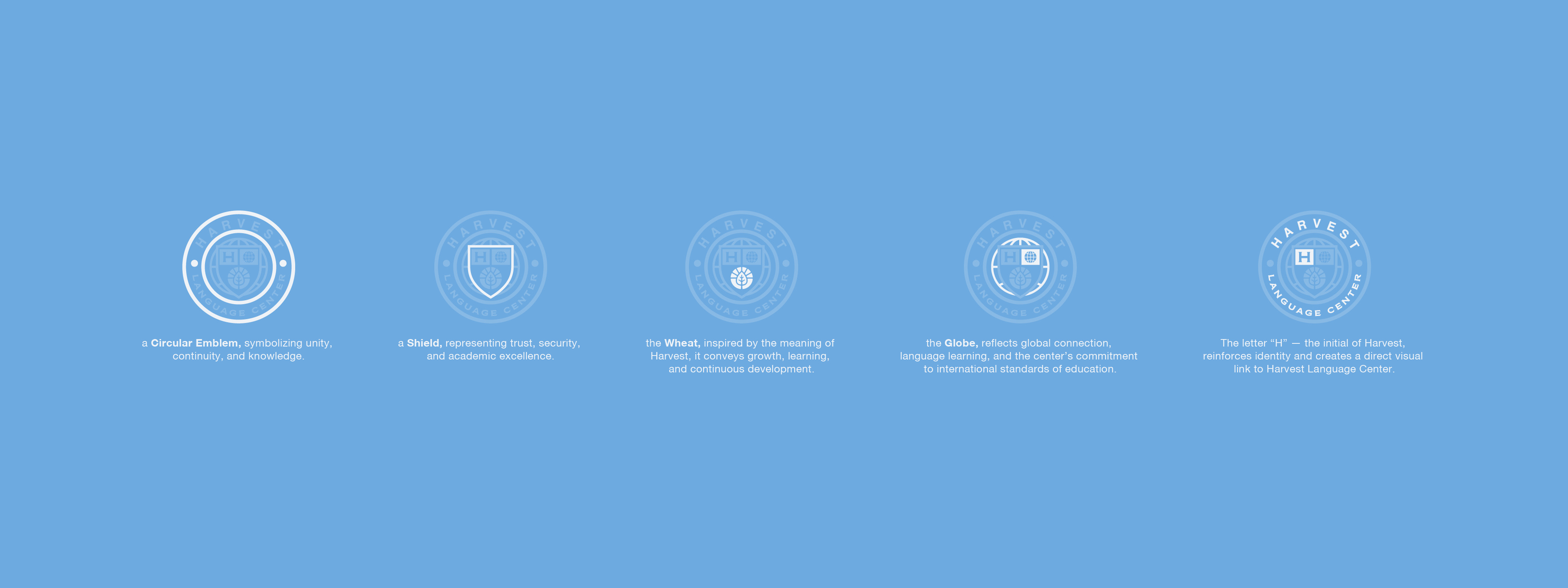
We drew inspiration from the visual language of traditional academic emblems, reinterpreting familiar symbols through a more global perspective. A circular seal forms the foundation of the mark, bringing together a shield that represents knowledge and integrity, the letter “H” and a globe that express identity and international connection, and a wheat symbol that preserves the essence of Harvest; growth, cultivation, and the continuous pursuit of learning. Each element was chosen to contribute to a story larger than the logo itself.
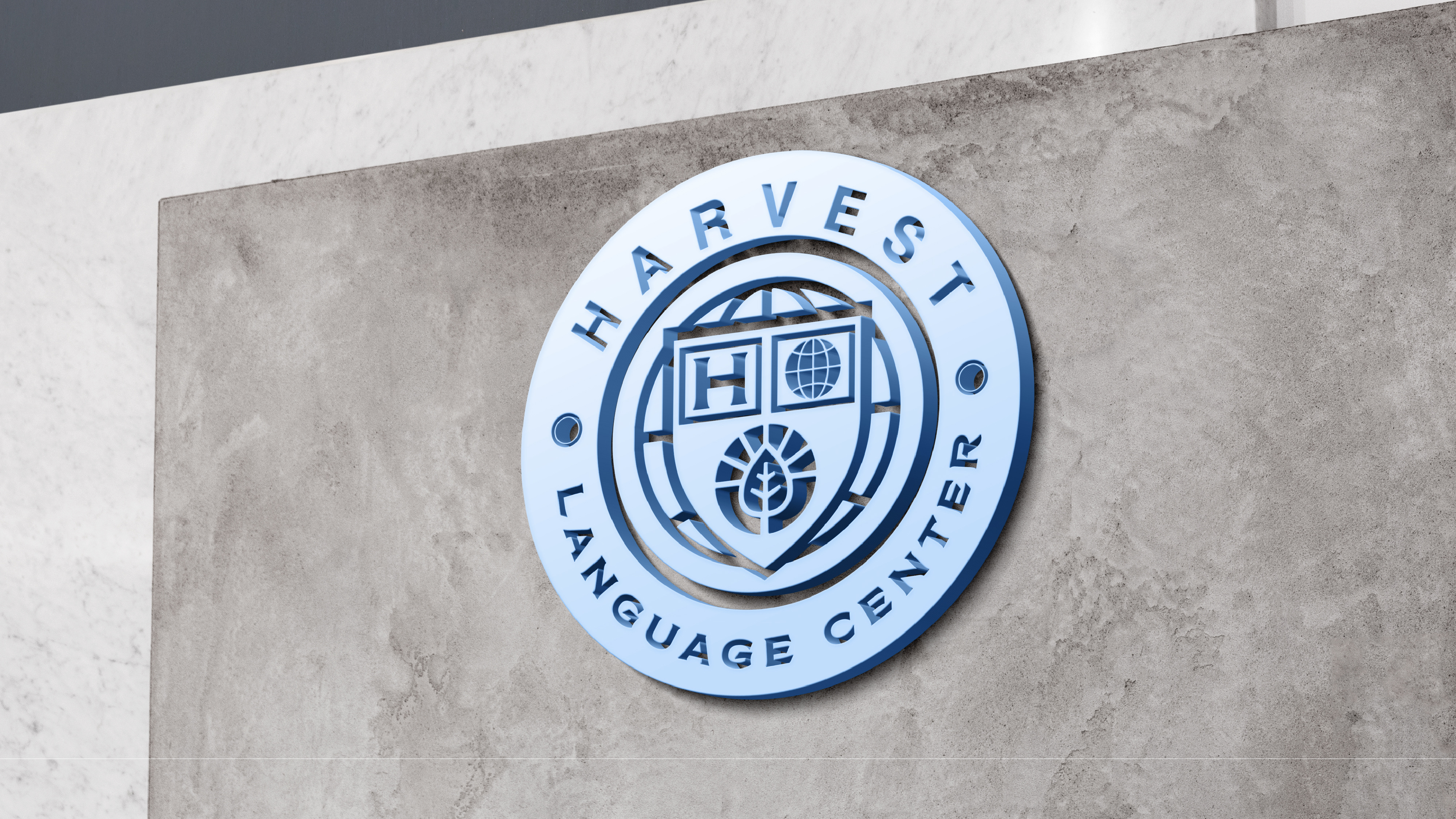
The identity was designed to continue Harvest’s story, not start a separate one. As the institution expanded into language education, its visual language needed to evolve alongside its ambitions. We reinterpreted the familiar elements of Harvest within a circular academic emblem, creating a bridge between the school’s established educational legacy and the Language Center’s focus on global communication. The result is an identity that feels connected by heritage, yet distinct in purpose.
Before shaping the visual elements, we explored the ideas that define the center’s experience: curiosity, communication, growth, and cultural exchange. The moodboard brought these values into focus through references to academic environments, language, and the connections formed through learning. This exploration helped establish a visual direction that feels professional without becoming distant, and educational without losing its sense of openness.
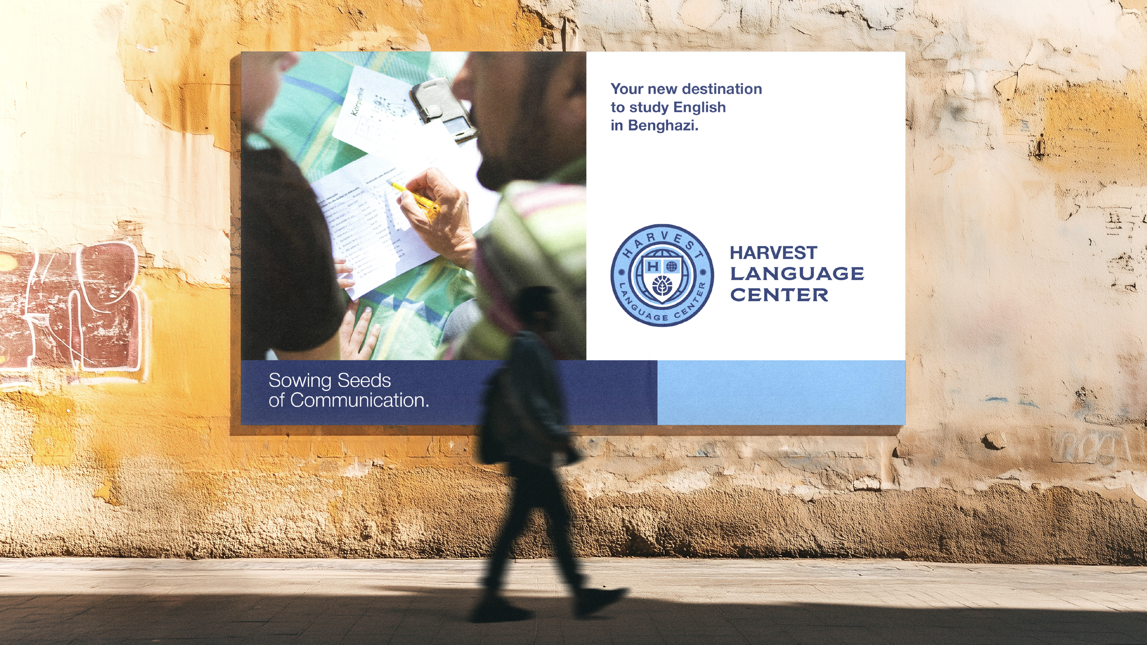
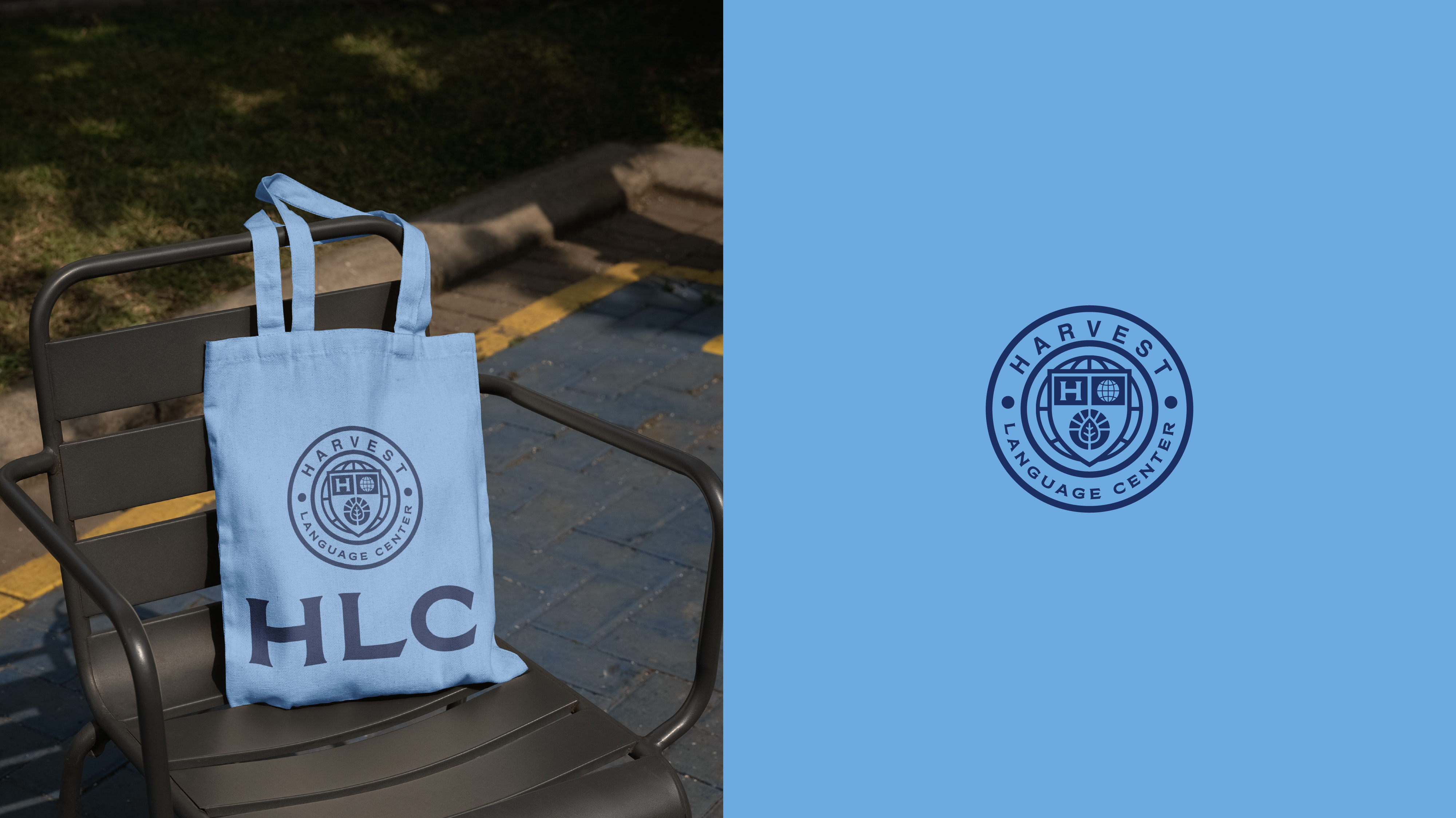
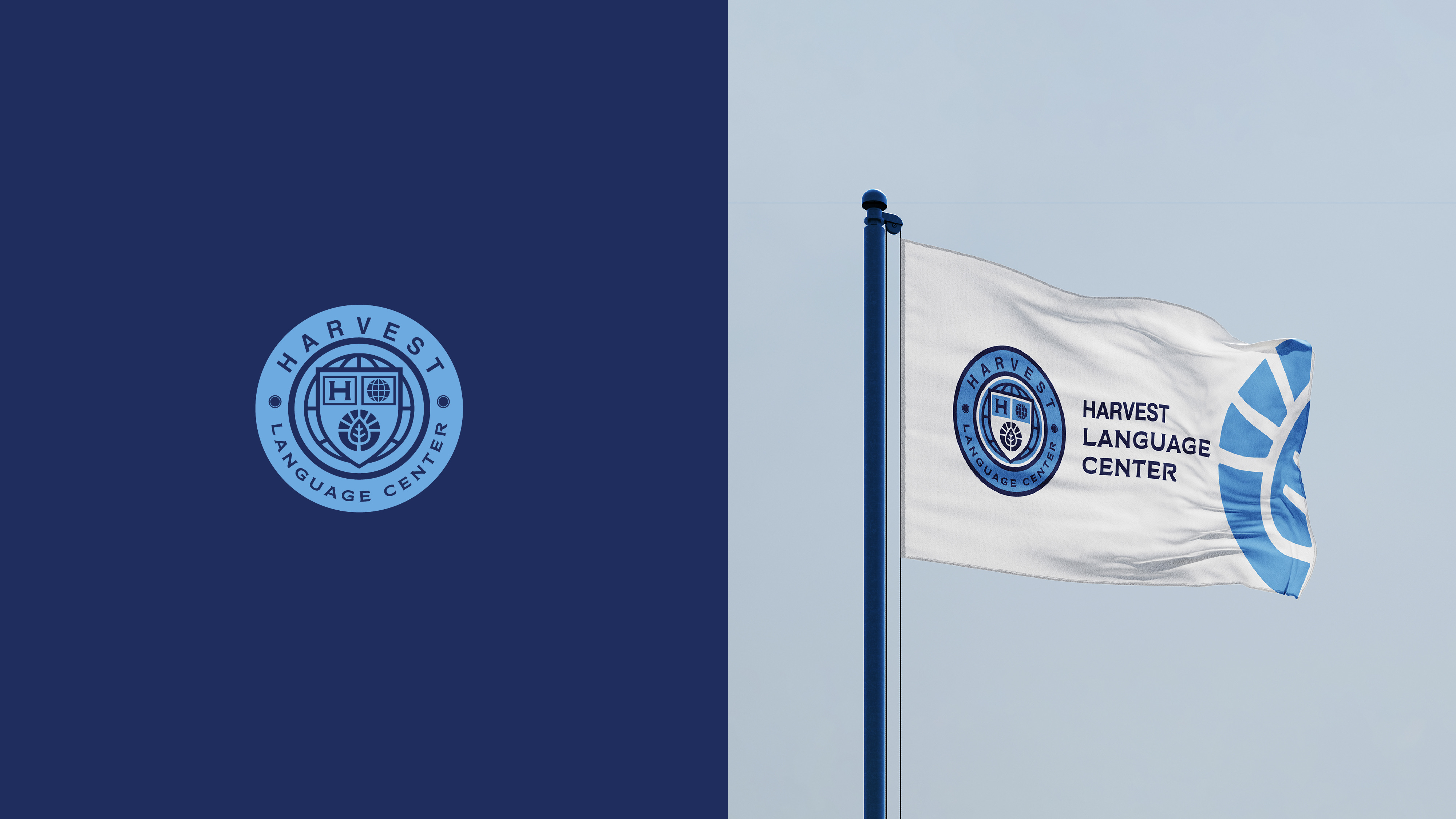
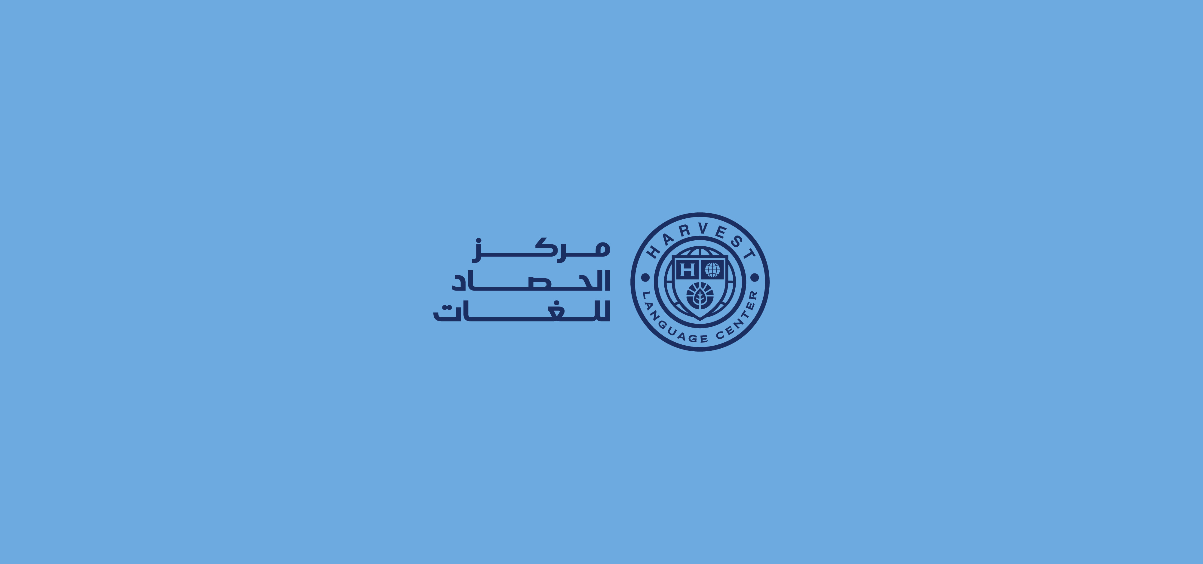
At the heart of the identity lies a balance between academic credibility and human connection. Harvest Language Center is built on the trust associated with Harvest International School, while introducing a personality that feels more accessible, globally aware, and forward-thinking. We wanted the brand to communicate confidence and integrity, while still welcoming learners into an environment shaped by curiosity and continuous development.
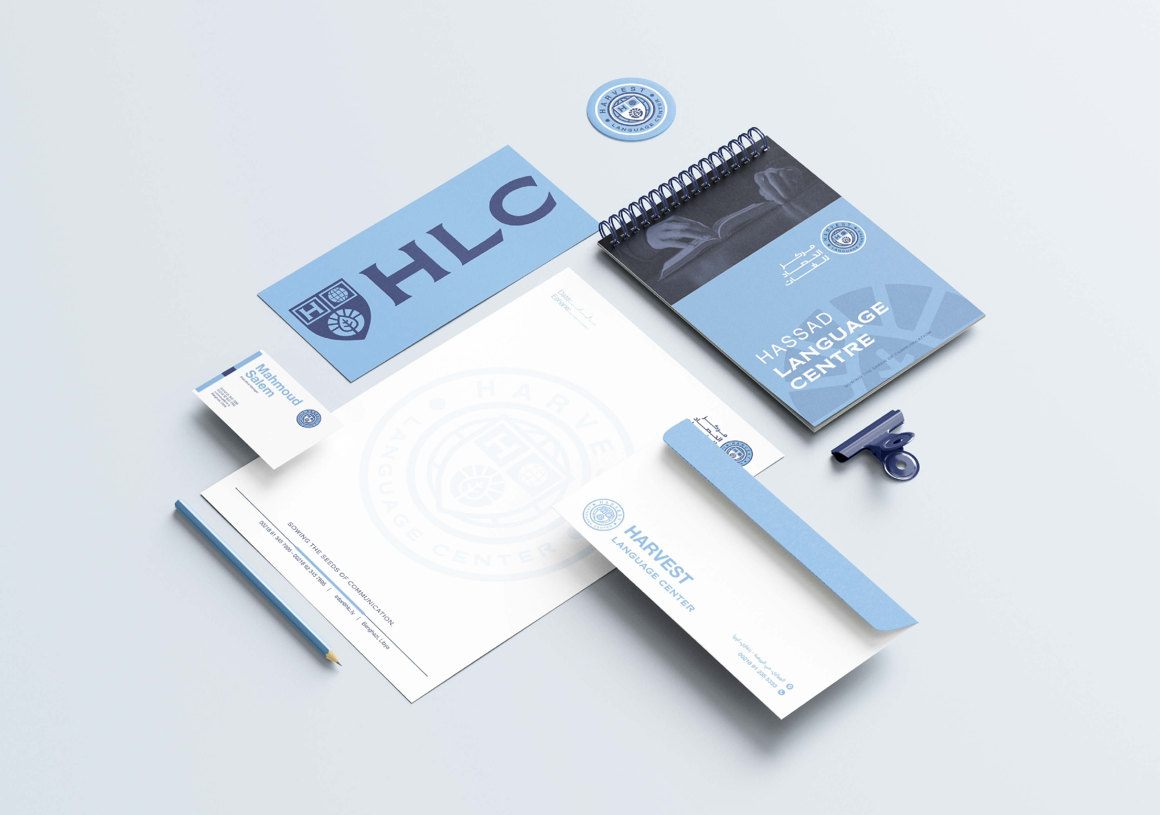
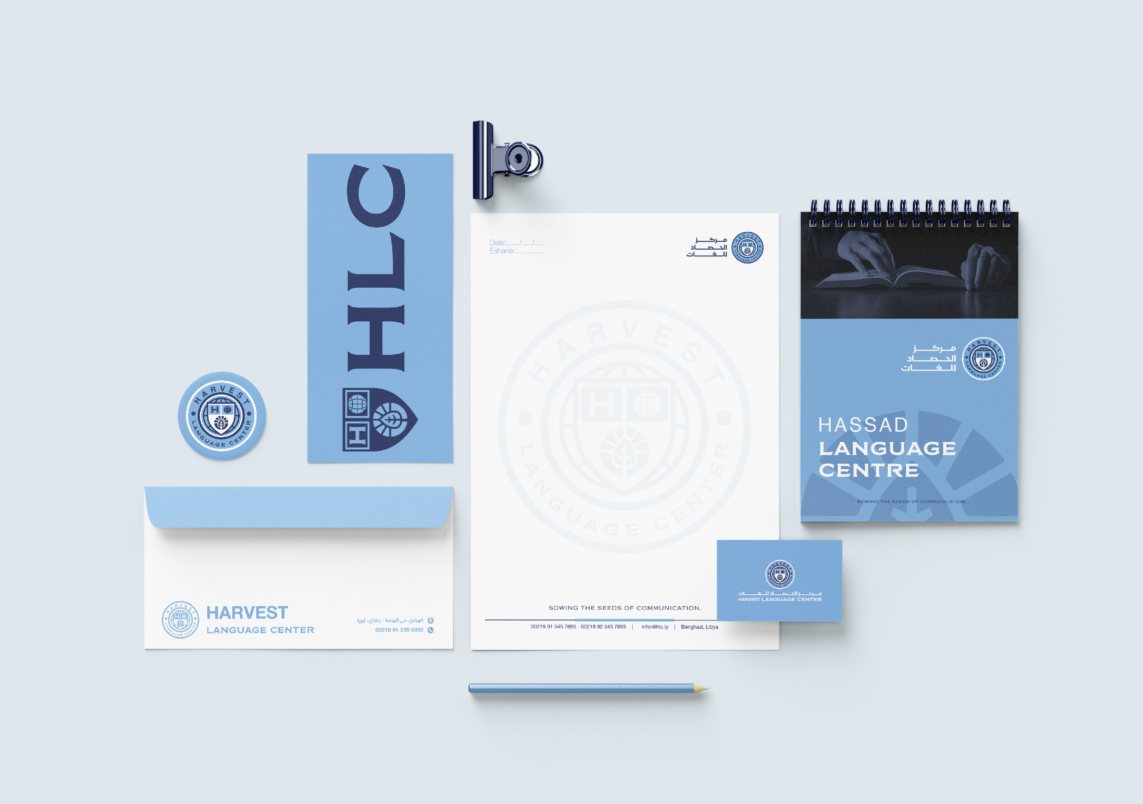
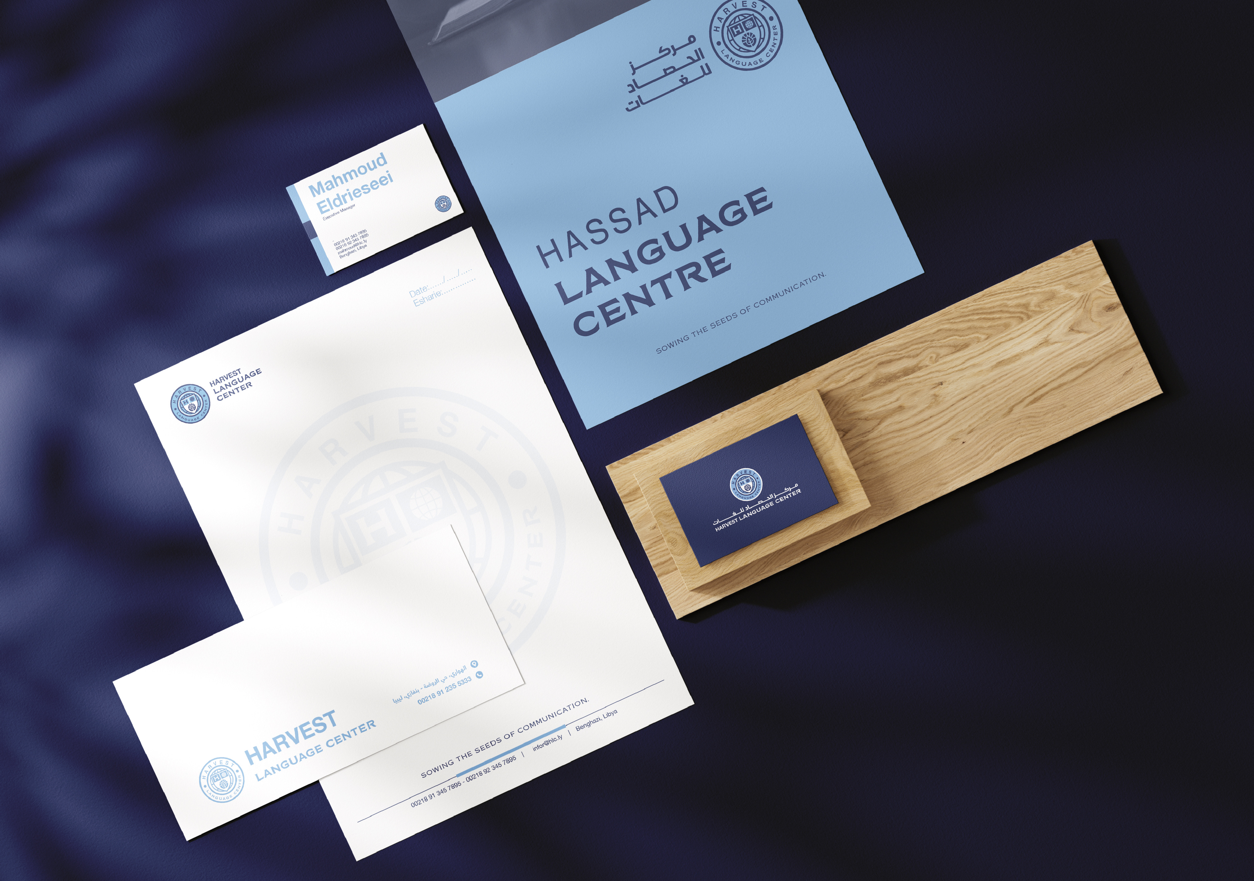
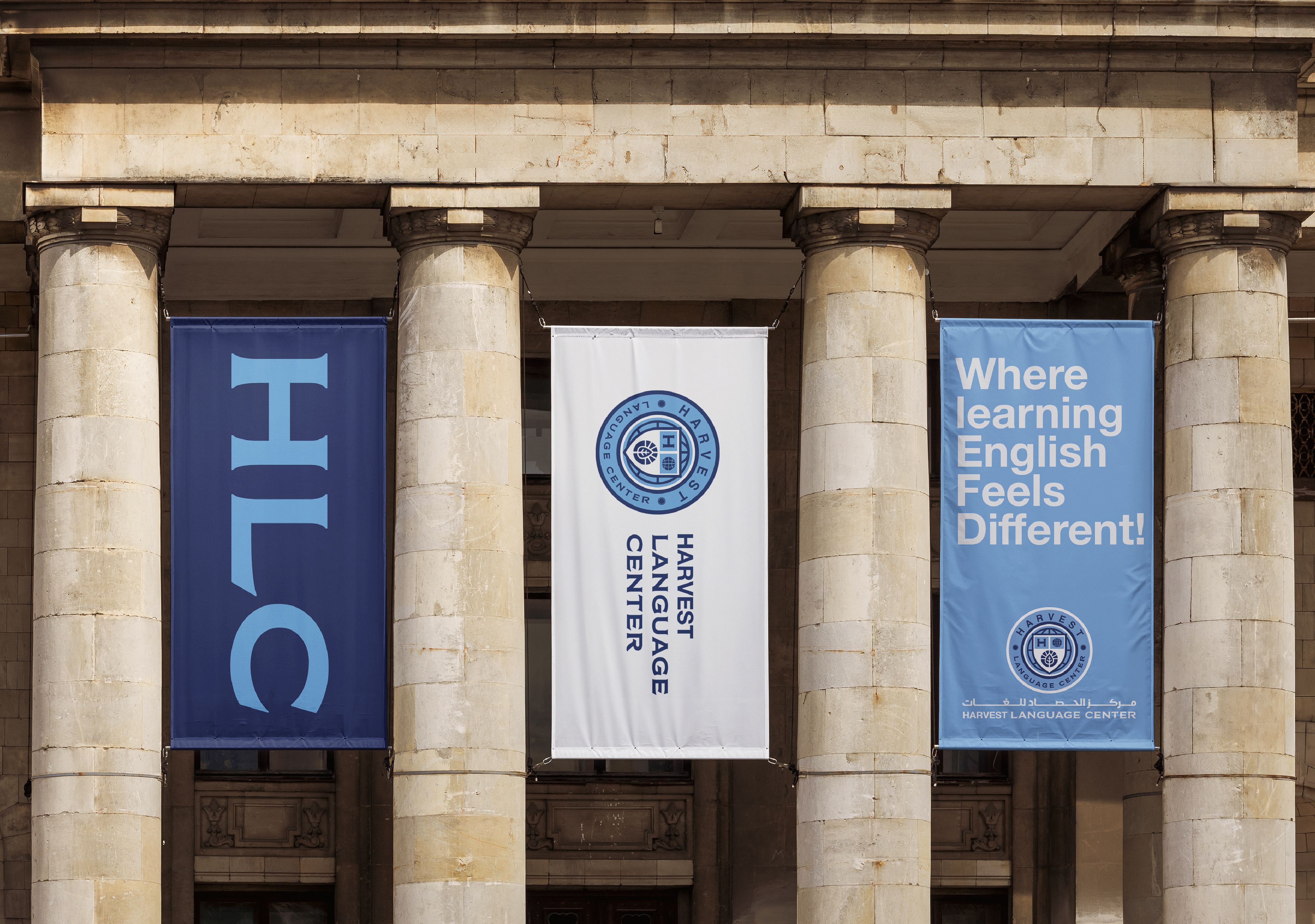
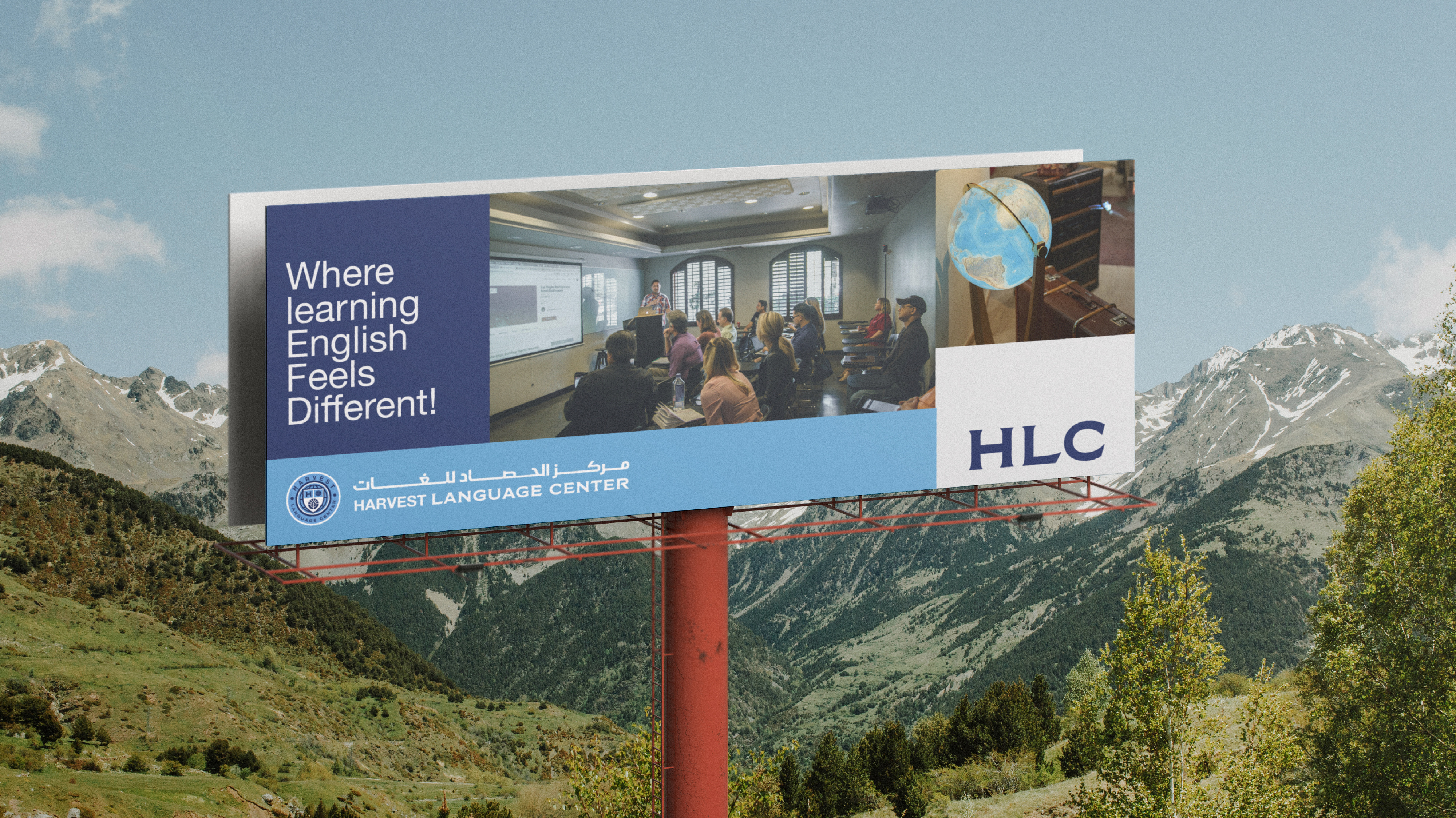
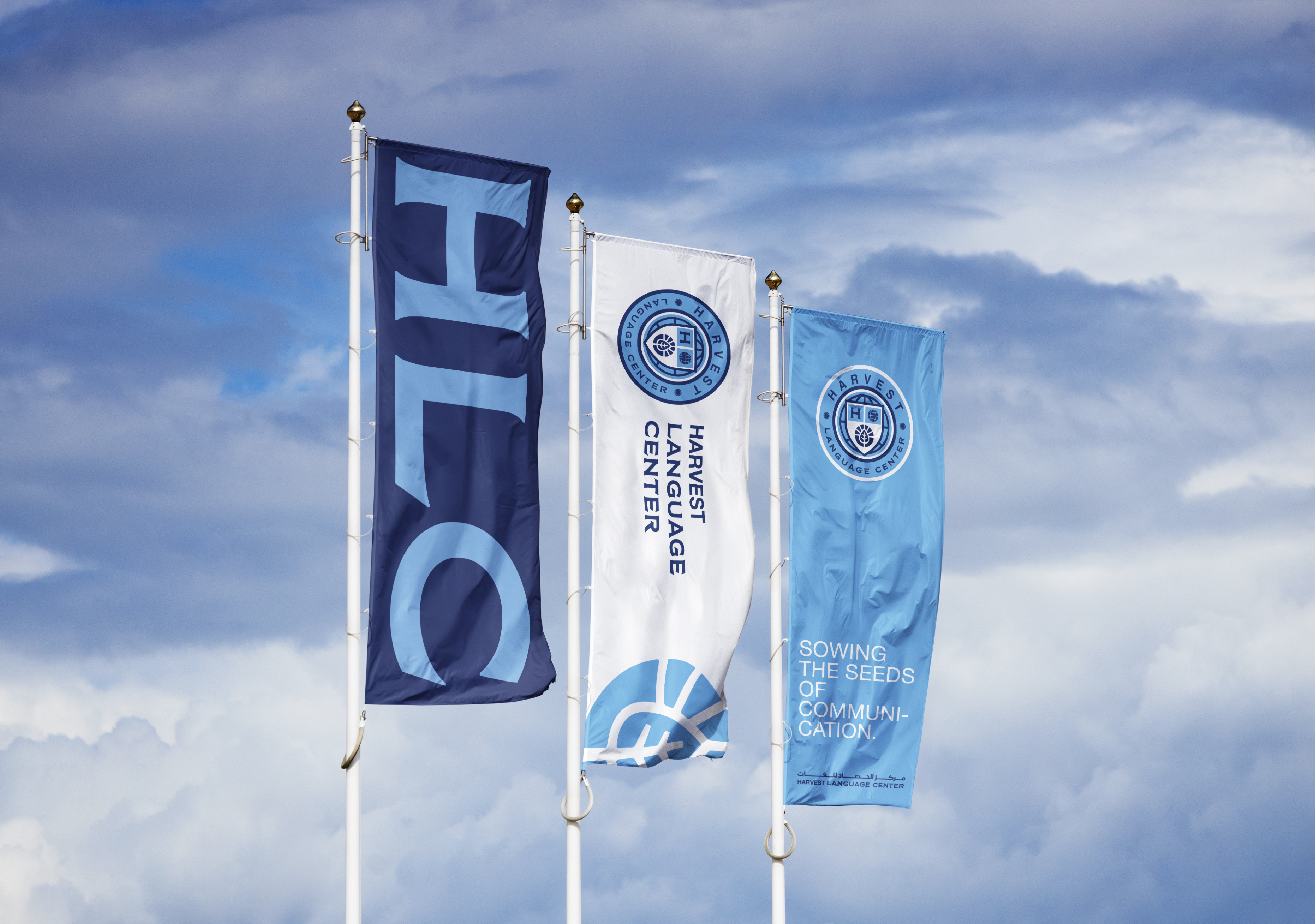
Color became an important part of defining the relationship between the two institutions. The deep navy blue carries forward the visual equity of Harvest International School, maintaining familiarity and trust. The introduction of light sky blue creates a softer, more open expression that distinguishes the Language Center within the wider brand family. Together, the palette and emblem establish a visual language that is cohesive, adaptable, and recognizable across different touchpoints.