Boom Shirmp
Boom Shrimp Restaurant
DESCRIPTION
Boom Shrimp is a reimagined Libyan seafood brand born from a family legacy of fishing and culinary expertise. The new visual identity captures the restaurant’s authentic coastal roots while introducing a fresh, modern energy that reflects today’s evolving dining scene. Bold, vibrant, and full of movement — the brand embodies freshness, flavor, and the dynamic spirit of the sea.
TAGS
INDUSTRY
Restaurant
YEAR
2024
SERVICES
- Visual Identity
BRIEF
Why Studio was commissioned to create a bold visual identity that respects Boom Shrimp's heritage. The project focused on building a complete visual identity for Boom Shrimp — one that captures its lively personality and premium standards, while balancing tradition and modernity. The goal was to create a logo and identity system that express freshness, speed, and coastal vibrancy, positioning Boom Shrimp as a brand that carries its legacy forward while embracing innovation for modern audiences — all while staying deeply connected to Libyan culture and flavor.
FINDING
The main challenge was to modernize a well-known, beloved local restaurant without losing its character. Research showed the new design needed to express energy, freshness, and creativity, while staying true to the restaurant's origins in Libyan fishing culture and the Boom family's distinctive culinary identity — capturing the authenticity of a family rooted in fishing while adding a fresh, contemporary edge that connects with today's dining culture. This led to a dynamic and instantly recognizable logo featuring a stylized shrimp illustration intertwined with bold typography — symbolizing movement, energy, and flavor. The vibrant color palette and striking composition express the brand's youthful energy and coastal inspiration. This updated visual system now supports everything from packaging to interior graphics, social media presence, and future brand expansions across the Boom franchise.

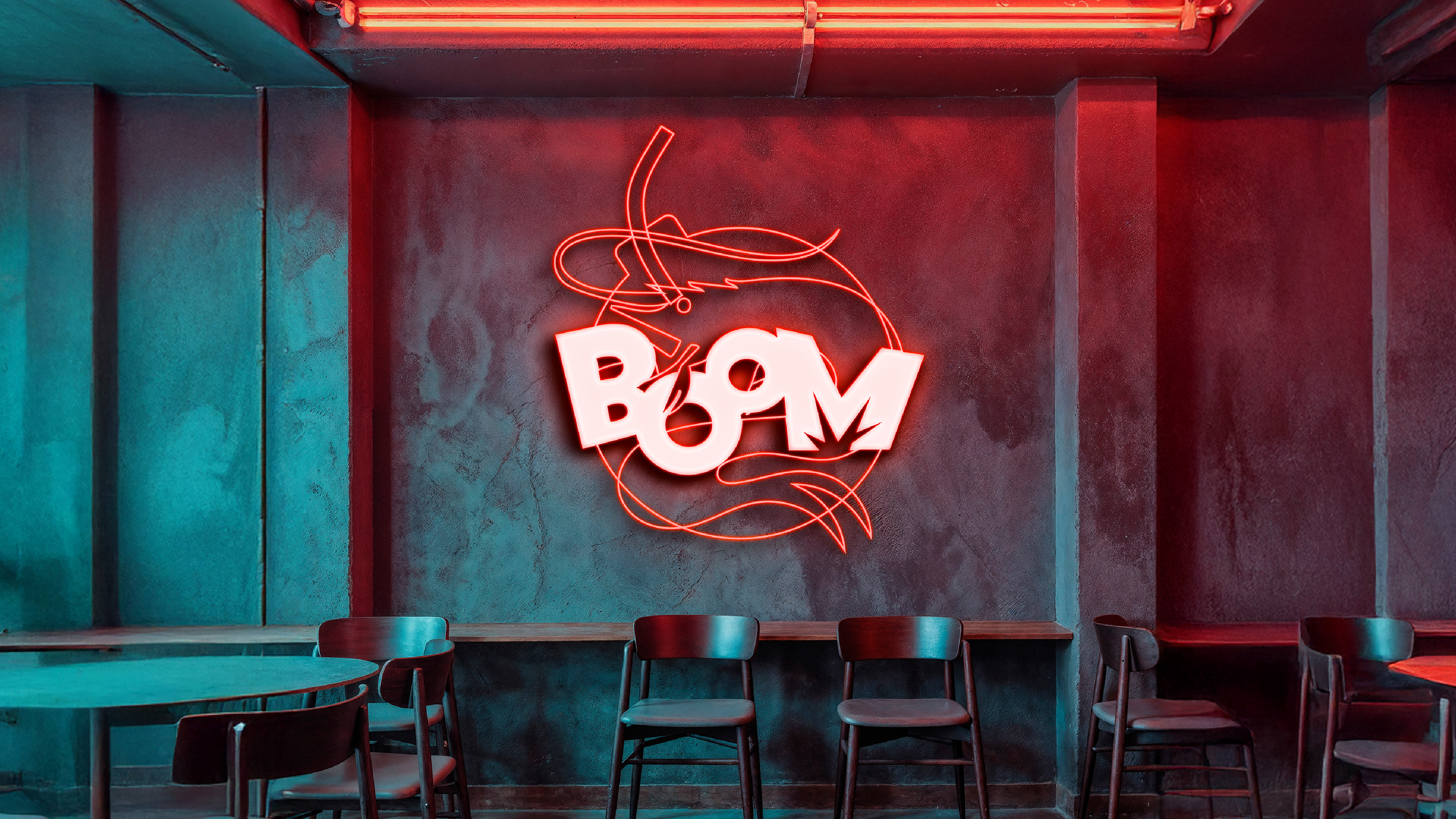
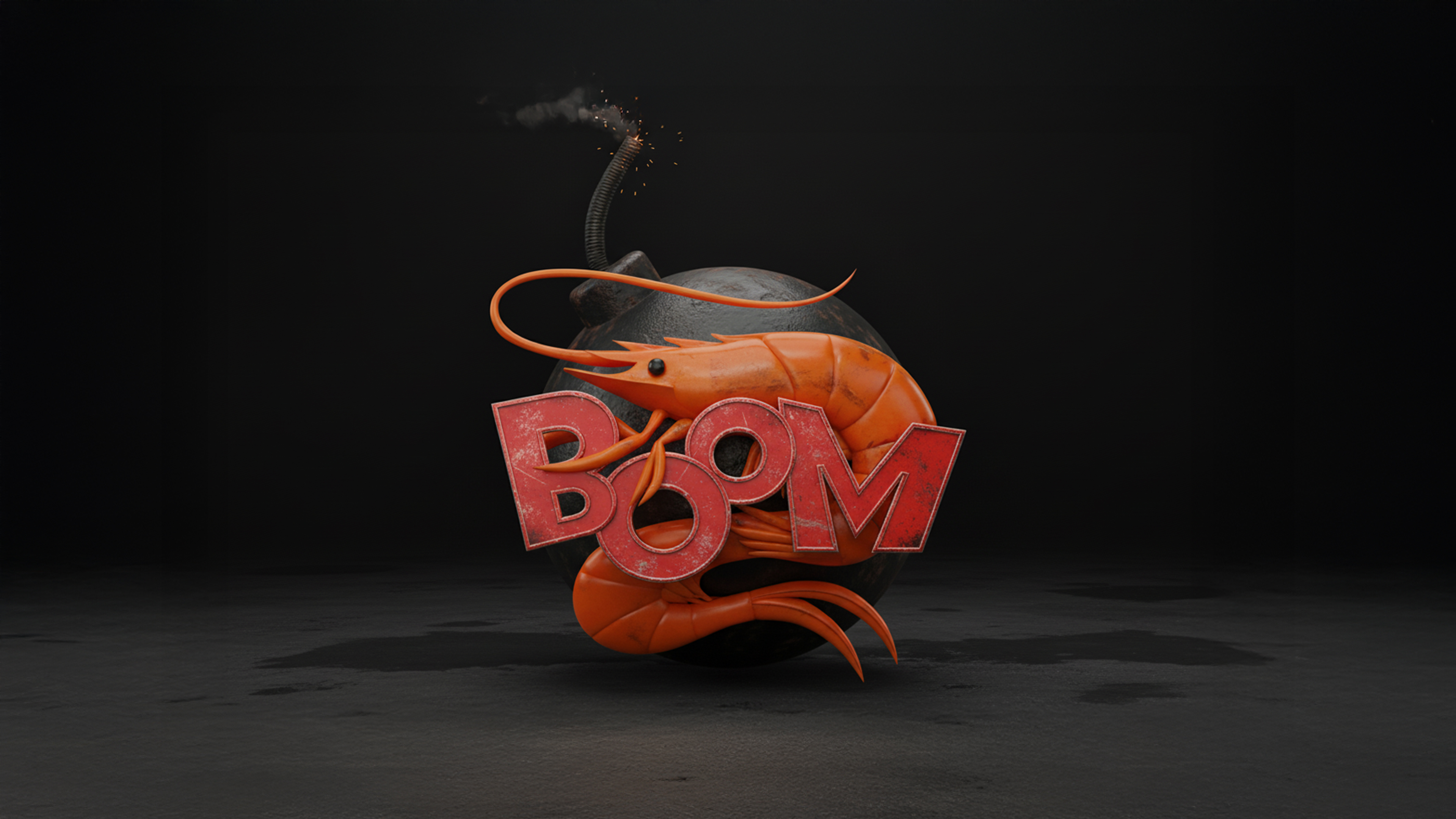
At the center of the Boom Shrimp identity is a mark built to move as fast as its name sounds. A stylized shrimp curls through the composition in a single continuous line, its silhouette forming a bold circular badge — instantly recognizable, whether pressed onto packaging or lit up in neon on a restaurant wall. Nestled inside, the word "BOOM" is set in a thick, comic-style typeface with jagged, energetic edges, echoing the punch and impact of an explosion — a nod to flavor that hits fast and hard. The interplay between the fluid shrimp illustration and the punchy, graphic wordmark captures the essence of the brand: playful, energetic, and full of character, while still rooted in the coastal, fishing heritage the Boom family built its name on.
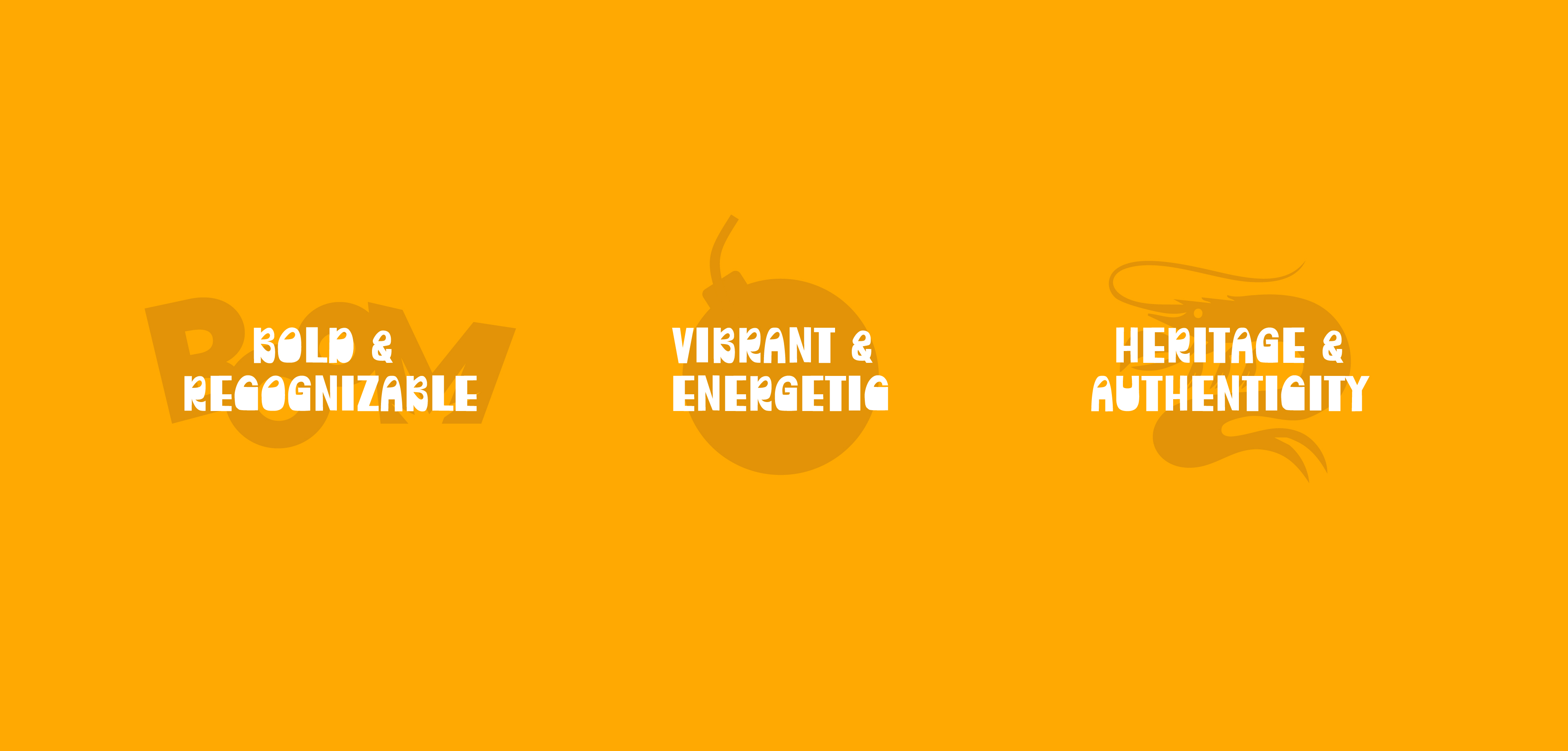
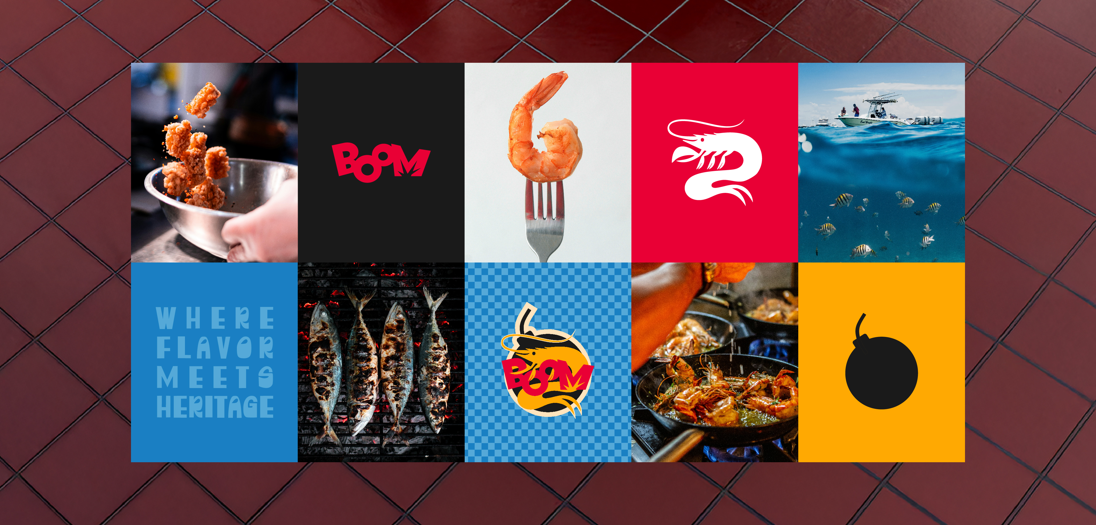
Boom Shrimp is built on three pillars: bold & recognizable, vibrant & energetic, and rooted in heritage & authenticity — carried through far more than the logo alone. A punchy yellow anchors the identity, paired with deep red and near-black, giving every touchpoint the same loud, appetite-driven energy, whether it's a packaging bag, a cup, or a wall inside the restaurant. That boldness is balanced by a distinct visual texture: comic-style linework, checkered patterns, and a raw, high-contrast photography style — fresh shrimp mid-sizzle, whole fish on the grill, hands at work — that keeps the brand feeling authentic and tactile rather than overly polished. Together, the color, pattern, and imagery build a world that feels fast, fun, and unmistakably Boom — proof that the identity was never just a mark, but a full sensory language. "Where Flavor Meets Heritage."
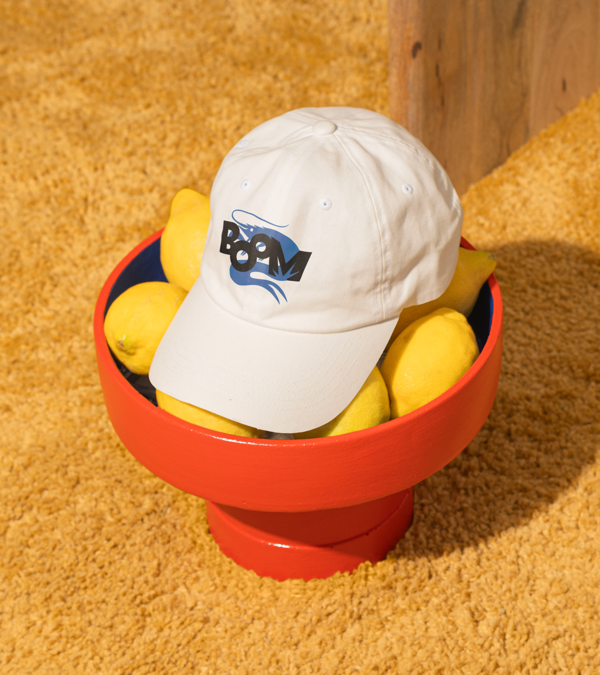
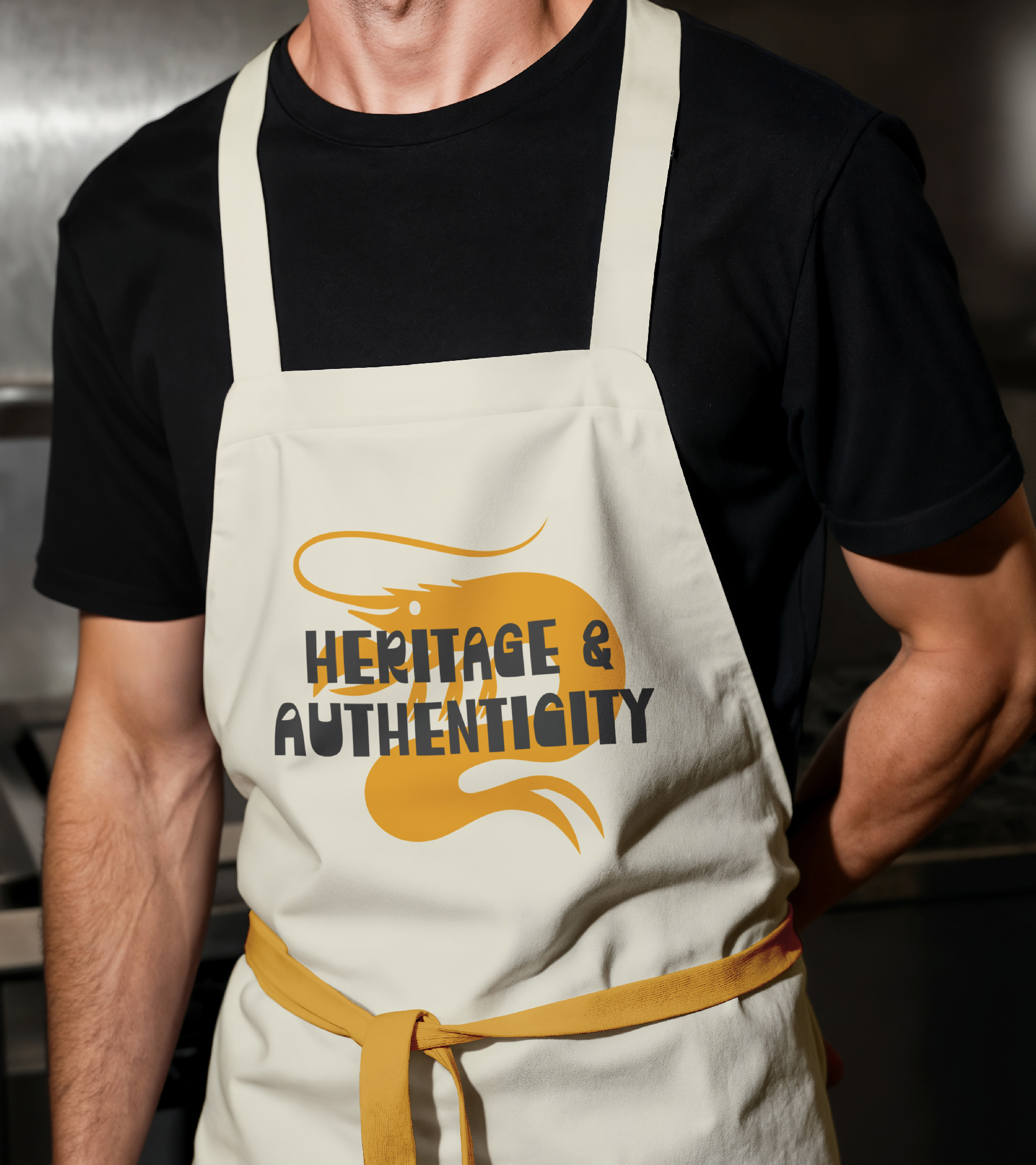
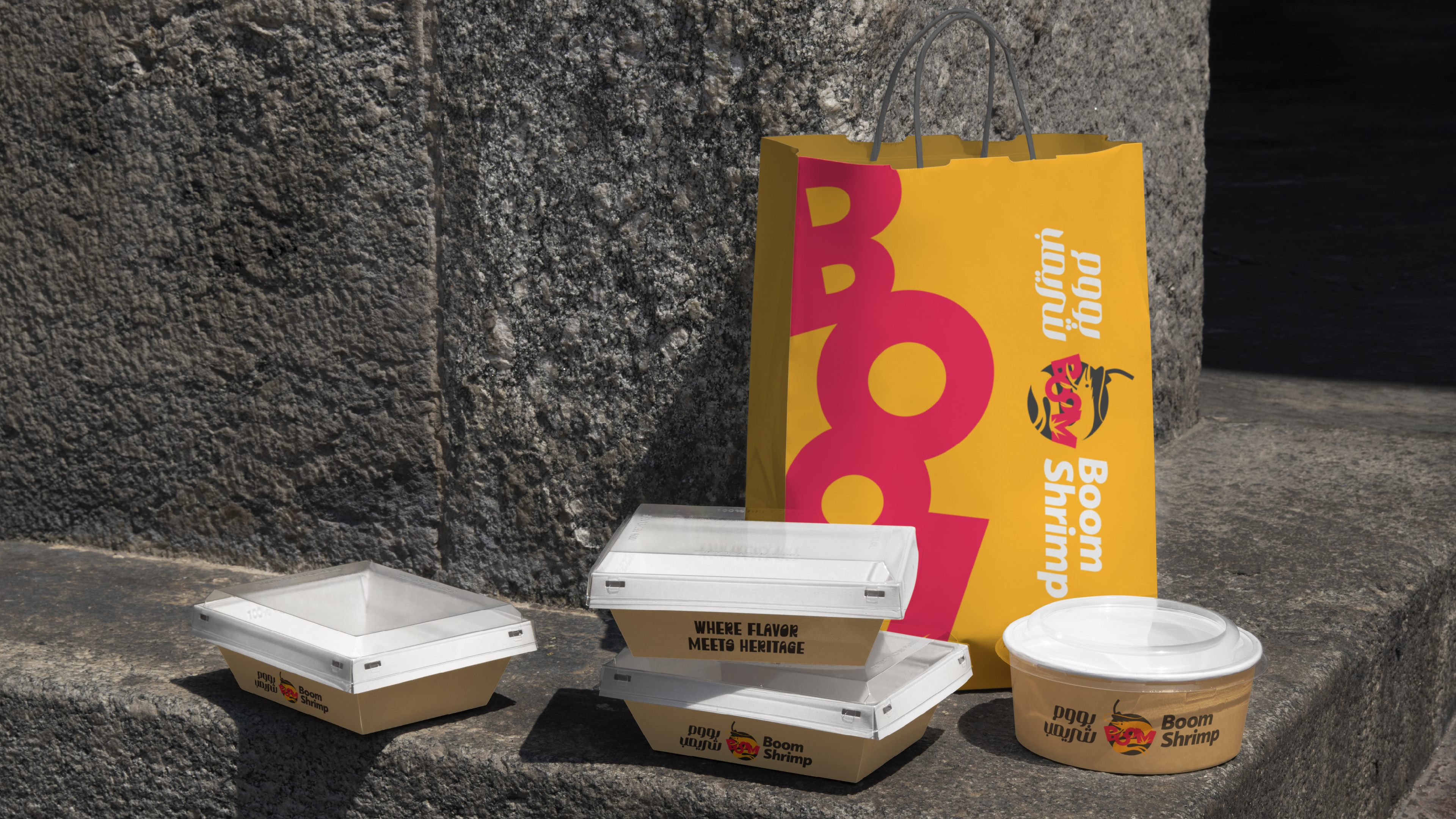
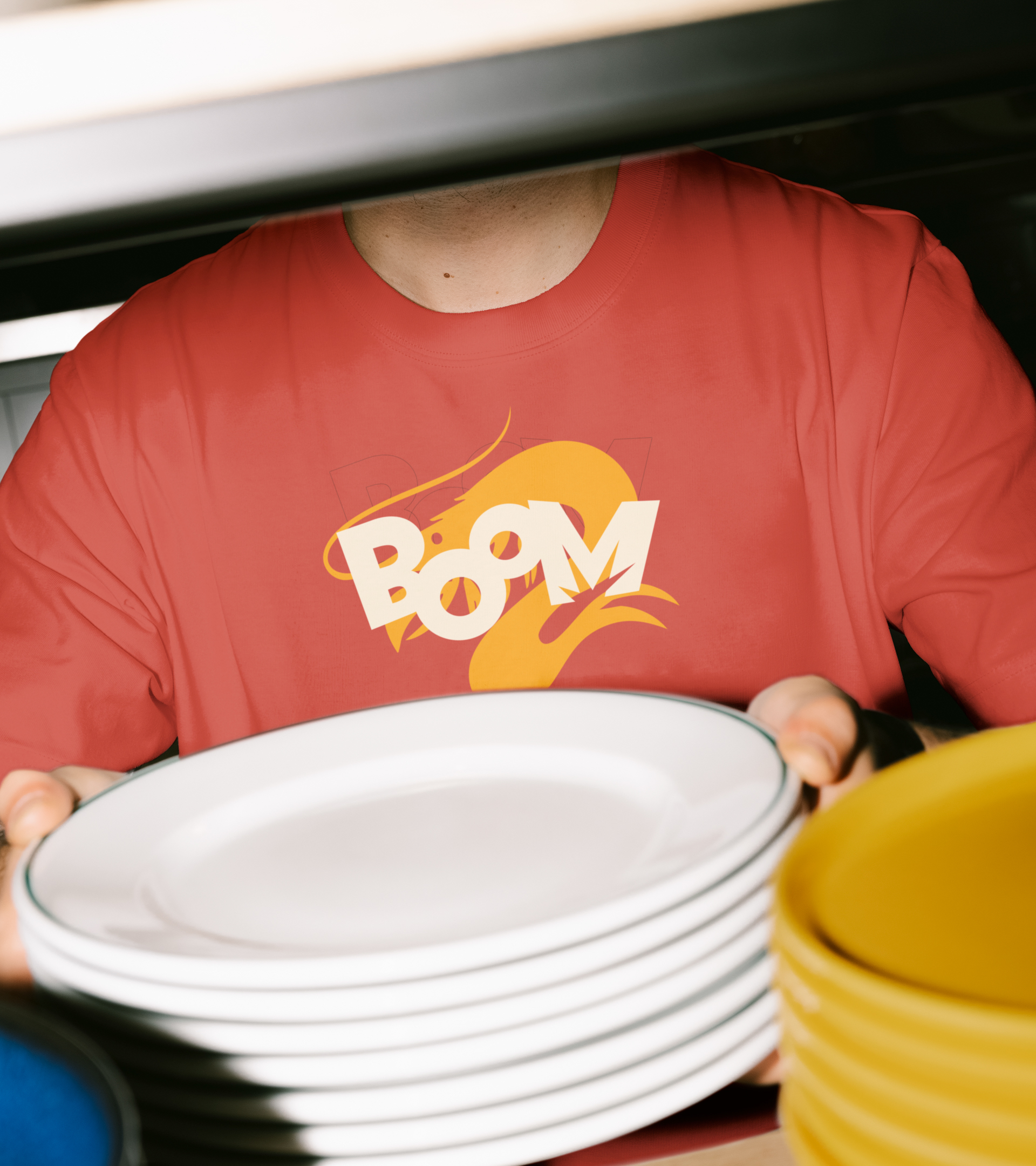
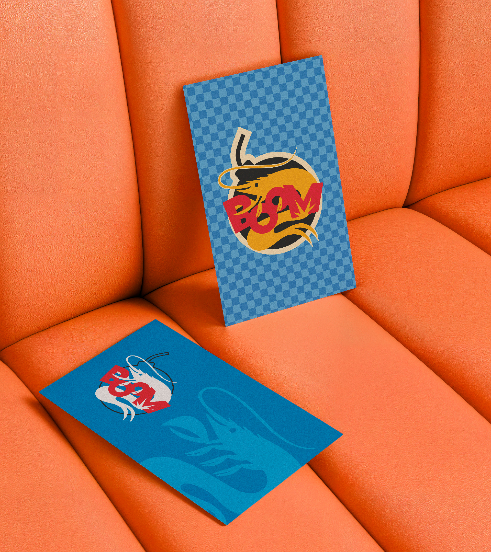
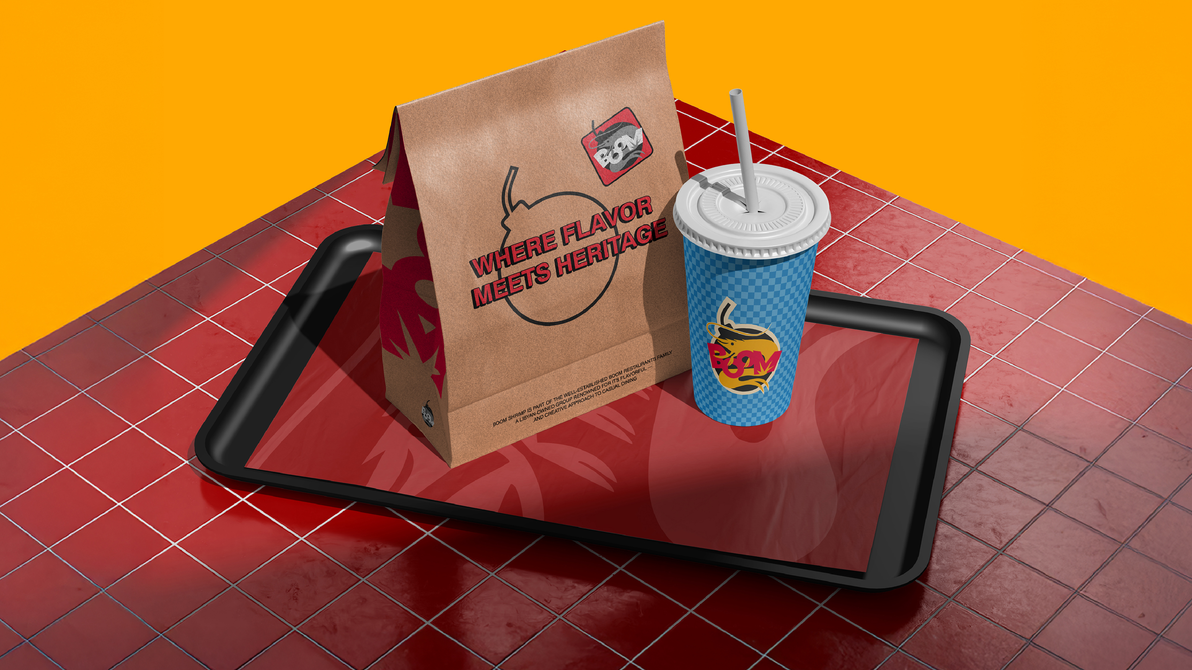
A strong identity only proves itself once it leaves the page — and Boom Shrimp carries its energy everywhere it lands. The signage above the storefront, the merch bag, the takeout packaging, the staff apron and tee, the coasters on the table, the billboard against an open sky: every application speaks the same visual language of bold yellow, deep red, and punchy black, wrapped in the brand's comic-style linework and playful shrimp motif. What makes the system work in the real world is its restraint under pressure — the same "BOOM" mark that feels loud on a billboard reads just as clearly stitched onto a cap or printed small on a menu card. The tagline, "Where Flavor Meets Heritage," travels just as easily, anchoring everything from packaging to outdoor advertising with the same confident tone. The result is a brand that doesn't just look consistent — it feels inevitable, showing up with the same energy whether it's on a plate, a wall, or a passerby's shirt.